Saturday 12 April 2014

Landscape Drawing - Colour in Spring


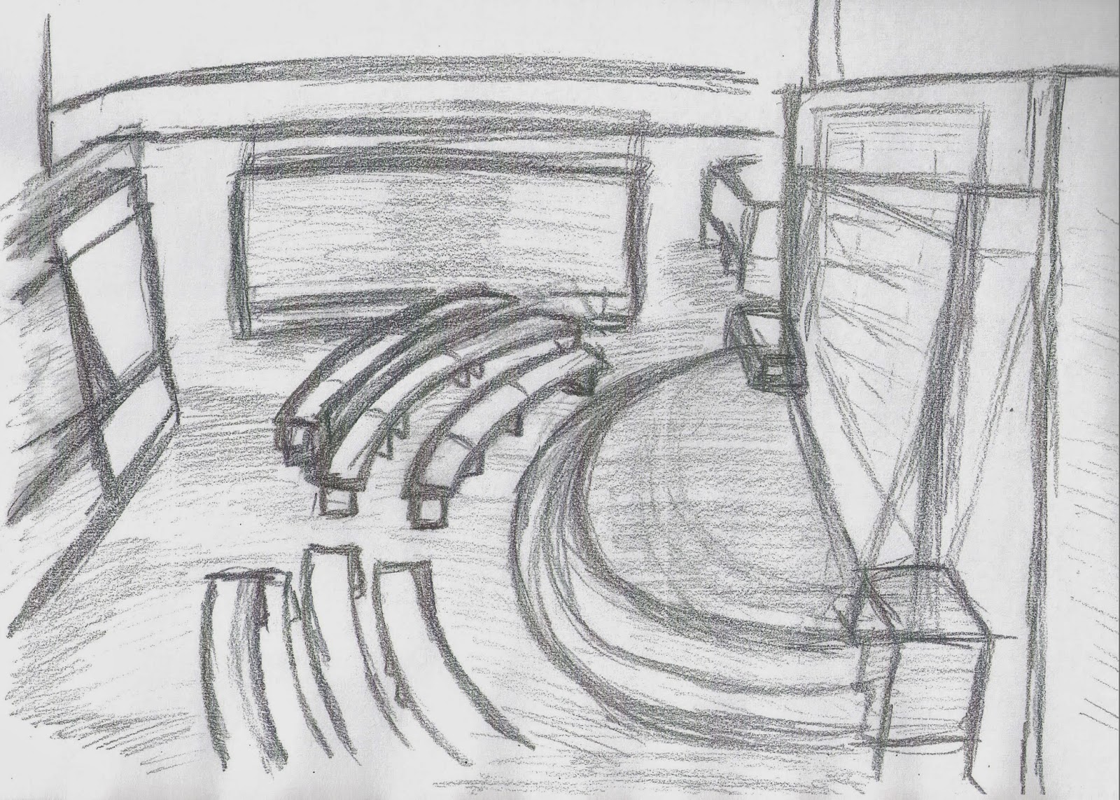
In this drawing I have tried to show the colours in spring using different techniques to create effects within many parts of the drawing. Some of these techniques used are mixing of different colours. For example I used two different shades of green as well as brown and grey for the trees. This was because I wanted to vary the colours for each of the trees. I also used this technique throughout the entire picture to create a mixture of colours. 

Some other techniques used illustrate sunlight. I did this by adding a mixture of yellows through the gaps in the benches. I have used most colours to show the vibrant environment. I have tried to balance out all of the colours giving the whole drawing a warm feeling. In this picture the main focus is the bench and the chair which are much darker tones compared to the main background. I tried to keep the lighter objects bright without making them too bright for the balance of the scene. 

Overall I think this was very interesting to draw and be able to use and learn the many different techniques.  I can now apply these techniques when creating future drawings of this kind or adapting them in others. I feel I have captured the environment well and showed the different colours by layering and mixing. 

Friday 4 April 2014

Landscape Drawing - Contemporary Architecture


For this drawing I used colour paper to draw modern architecture. In this drawing there were a lot of curved angles which was harder to draw. In the drawing I used coloured paper and conte crayon. I used only black and white; firstly by creating outlines in black and then using the white conte crayon to show light. In this environment there were many different light sources including wall and ceiling lights. Even though the environment was very simple it can be quite challenging. For me this as in the proportions. One of the main challenges in this drawing was the ceiling and the way it was shaped. It took me a couple of attempts to achieve the shape I wanted. I have left in the lines where I had made the mistakes.

I have created shadows throughout the scene which was stronger in some areas than others because of the walls. I wanted to show the different colours on the walls, that is the darker or lighter walls, through the shading.

Overall in this drawing I feel I have shown the modern architecture and the different lighting and shadows. This was a very challenging environment to draw because of its simplicity. I liked using the conte crayon in this way because it was interesting learning about the effects of just black and white on coloured paper. I think this makes you focus more on light which will help with future drawings I produce. 

Friday 28 March 2014

Landscape Drawing - Classical Interiors


Classical interiors is a lot harder to draw than modern day. This is because of the more complex and detailed architecture involved. In the drawing above I have shown the detail that is involved with classic interior in a small but effective drawing. I used brown conte crayon as I felt this was the most effective tool to use. I also used different strengths of shading throughout the drawing to create the natural light. 

This interior was made of stone. I wanted to try and show this using the conte crayon. I wanted to show this because the type of texture that the interior is made of affects many different things. An example of this is the reflective lighting or light on the types of materials in the environment.


I have left in the mistakes as this shows the stages that I went through to get the final piece of work. The most common mistake that was made was in the drawing of the angles. This was because I had done the drawing at an angle itself. Doing this I was able to learn from my mistakes and be able to fix and develop them. Overall I learnt a lot about classical architectures with shading and angles.

Tuesday 25 March 2014

Landscape Drawing - Shadow and Tonal Values


In this drawing I have tried to show the different lighting effects using shading. I have drawn a stage with benches and displays which was a very good and interesting environment. There were a lot of different shadows created by artificial light. These were generated by display lights and ceiling lights. I have used a graphite pencil in this drawing as I thought it would best suit the effect I wanted to create. One of the main challenges with this drawing was the proportions of the environment.

When creating the different shadows there were also different types of actual materials to represent, for example wooden floors and white painted walls. I tried to show this by shading some areas either darker or lighter than others. It was interesting to explore how I was able to create detailed aspects using shadows and light sources throughout.

Overall this was important for me in learning to look at the shadows and light in a complex modern environment. There were many different angles to work with. This meant getting the look of shadows and the tones right was very important. 

Saturday 15 March 2014

Landscape Drawing - Scenic Composition


For the drawing above I was using the rule of thirds making the main focal point the hut. There are four main elements to this composition which are the picture area, depth, line and value. I have looked closely at the placement of each object in the drawing and decided how I was going to position myself. 

I made the focus on the hut so the lines of the drawing all came to that point on the page; this was using the golden mean. Your eyes move left to right. This was starting at the tree on the left moving down to the fence and then right to the hut. I felt this was very effective because the objects lead the eyes through the drawing.

I tried to create a sense of depth to the image with object placement clearly showing if an object was in front or behind. I included some background scenery such as bushes, however, I wanted to keep it simple so that the viewer's eye would be focusing on the hut. I used different tones to the drawing to give different feelings. I used charcoal as I thought this would be best for the drawing. This was because I could create different strengths of shading on the objects showing where the natural light was coming from. 

Overall I feel I have covered each of the 4 points and shown them clearly in the drawing in more than one way. Some things I would have improved however is more depth to the background. I do feel though I have used the rule of thirds and been successful in drawing the viewer's eye to the main focal point. 

Friday 7 March 2014

Landscape Drawing - Perspective of Curves


In this drawing I looked at the perspective of curves and how to draw them. In the image above there are many different angles however the big curved roof was challenging. I was looking at the curve from an angle however, I felt this was the best view from which to draw it. When drawing curves it is hard to get the proportions right so I had to plot where the roof was going to start and end. 

This was my first drawing using alcohol pens. I found this in some ways harder and yet easier to use. There are three different thicknesses to the pens. By first going over with the lightest I was able to map out or change the drawing in any way I wanted. I was then adding the layers with the pens once I had found the line I wanted. I used shading throughout the drawing to show the different light (however once scanned in, this was hard to see). 

Overall I feel it was very hard trying to get the proportions right when working on the curve but I think measuring helped. This was one of the hardest drawings done as it was the first time using the alcohol pens and drawing a large scale curve. I would improve the angles of the roof next time, however, I feel I have produced a good enough drawing to show this perspective.


Saturday 1 March 2014

Landscape Drawing - Angles in Architecture


In the drawing above there are many different angles. The building was very good subject because the front was at a slanted angle but the back had 90-degree angles. This drawing also included curves. I have included shading because this shows the shadows created by different sections of the building which did not have any natural light. I have chosen this perspective because there are many different features that do not repeat. This makes every line different. The smaller features such as the windows emphasise the different angles. The sides of the building are very important because they show in more clear detail their angles. 

Not all the angles of the building line up with each other but they do not overlap which makes the building very interesting to draw. From this viewpoint I was able to see this in more than one place; at the top of the building and at the bottom right hand side. I was able to show angles which have a very strong line and tried to learn the basic of modern architecture of the exterior. What also made this building stand out is that it was on a hill, so this meant that it created new angles and challenges.


Overall I enjoyed drawing this building because it was interesting to see the many different angles all come together from the viewpoint I had chosen. As this building was not just made up of one angle this was perfect for showing the many different angles in architecture.